5 Most Common Website Design Mistakes
May 26, 2021 9680 seen
Why Is It Important?
Today, almost everything is based on technology, therefore you need to have a website if you have a business. If you are considering creating or updating your website, be sure that you’re making it as best as it can be. Your website should engage your visitors and help them build trust or want to connect with you. There are several factors, elements, and design choices in web design which can make things harder; navigate, connect with, or trust. Unless you’re trying to find your target audience, this list will help you to discover the five biggest website design mistakes, and how to avoid them.The main goal of this article is to guide you to avoid these mistakes and make your website as good as possible.
1. Cluttering Your Website

Without a solid foundation, you run the risk of making one of the most common mistakes in website design: adding unnecessary elements just because they are available. It is better to spend time reading basic principles of design before you get started. This is because today, web design software offers such a vast range of tools and available options that amateur designers can soon become overwhelmed. Don’t confuse your users with busy designs, such as unwanted pop-up ads or auto-playing videos. Do an easy and clear design.
2. No Call to Action

Call to action or CTA is very important because it tells your visitors what to do next. Your visitors can be your potential customers, so you need to be sure they can take the next steps and know exactly how to get there. For example, if your call to action is "Call Us" and a visitor cannot find your contact page, this can be a problem. The lack of calls to action is even worse because then your visitor will not be involved and can easily go to the competitor with the knowledge you provided them! Keep your call to action short and clear, but make sure it's useful to both you and the consumer.
3. Lack of Visual Hierarchy

The next website design mistake on our list is a slightly more complex one, at least for beginners in web design. Overlooking the importance of visual hierarchy is one of the most common mistakes we see on websites. Visual hierarchy is defined as the ordered arrangement of items according to their importance. If you don't get it right, users can be bombarded with various features of your projects, and they all compete for their attention. They won't be effectively targeting your call to action, which means no conversions.
To create a strong visual hierarchy, think carefully about what your visitors’ needs are. Always do UX research and make sure the user flow is intuitive and seamless. E-commerce sites are a good example of this. The best ones retain their individual branding mostly outside of the user experience. Instead, they act as a portal through which customers can discover and purchase products specifically designed for them. Typically, well-designed e-commerce sites will only remind the user which site they are on for one moment: right after they have completed the smooth and easy process of buying a particular product.
4. Not Designing for Mobile

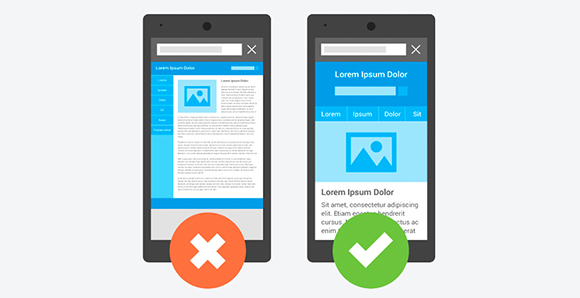
Most companies make this mistake when they first create a website. Just as web design is still considered to be something that happens “on the computer,” many people still view mobile browsing as an “alternative” to the “main experience” of a website — the desktop site. This is no longer the case. In fact, mobile browsing currently makes up the bulk of internet traffic and as such, many designers will actually create a mobile site before they make a desktop site.
This is known as the mobile-first strategy and is now very popular even among large companies. Designing for a desktop at first can be a mistake because you run the risk of making your website slow, and by that, it doesn’t appear user-friendly on mobile devices. We recommend designing your website for mobile devices first and then expanding to a desktop version of the site next. Here are some reasons why. Based on London-based web developer Alexander Williams of Hosting Data, improving conversions should be your main goal when designing a website, and in a world where the majority of visitors are going to be using a smartphone, and it is important to be able to buy products straight from the phone.
Simply put, your web design needs to be accessible and responsive over different devices. As we’ve mentioned before, achieving this can be difficult, because it involves paying attention to a wide range of factors, from the layout of your pages to the size of the images you are using.
5. Missing Contact Information

The last mistake that we are likely to speak about is missing contact information. When it comes to page design, even basic website builders come with tools to customize grids, recommendations, and columns. Many web design beginners overlook these tools, thinking that they are only suitable for older, “blockier” sites. In reality, grids remain the basic building block of every well-designed web page and should always be used to organize the visual elements of the page. Grids and guidelines formed the basis of the core graphic design skillset long before web design came around and they’ll certainly continue to be a fundamental tool for years to come. Regardless of whether your grid and column lines are visible on your web page, they still form the basis of the basic structure of your site and the proportions between elements. Grids help divide web pages both horizontally and vertically and thus determine the alignment between different design elements. However, it is also possible to combine grid design with more modern design and consumer research methods. The variety of ways consumers interact with the Internet has generated a similar range of expectations when it comes to how they expect different types of web pages to look and feel.


