Do You Need a Landing Page?
May 27, 2021 9615 seen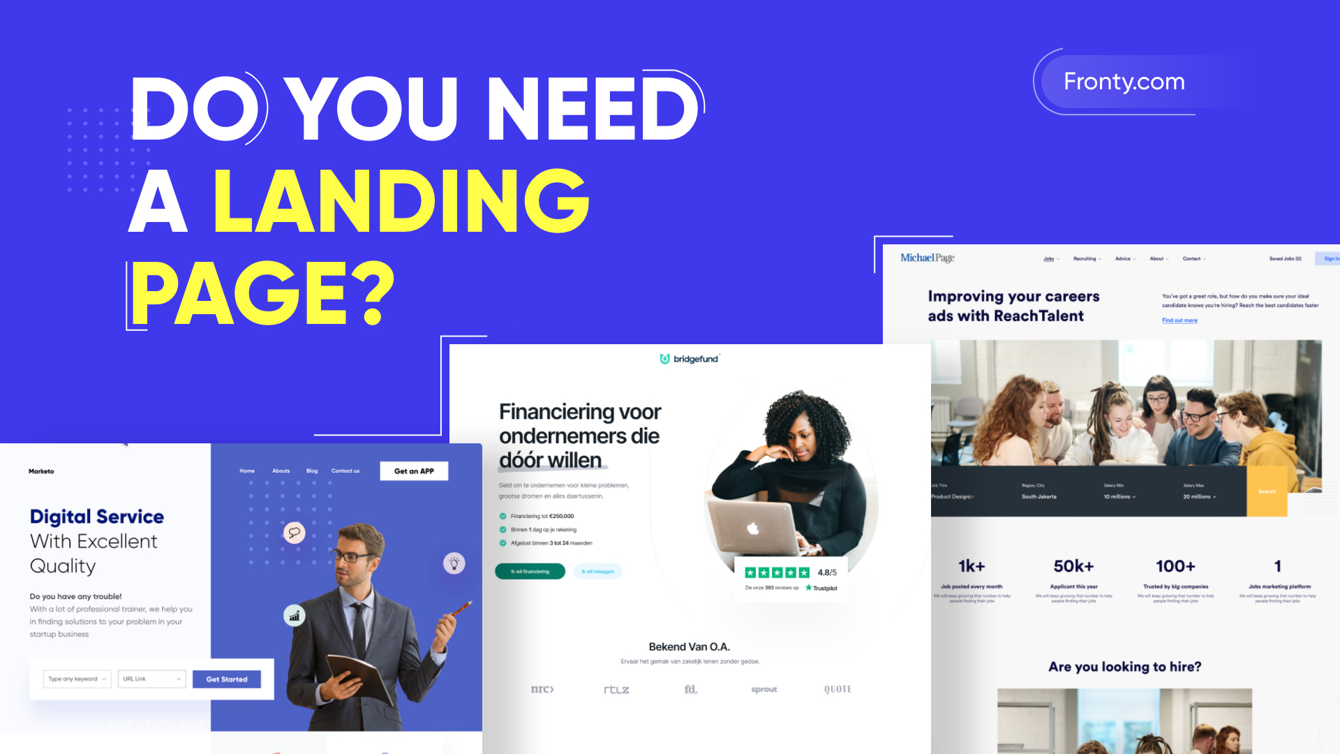
Why Use Landing Pages?
Overall, a landing page is a standalone web page created specifically for a marketing or advertising campaign. This is where a visitor "lands" after they click an advertisement from Google, Bing, YouTube, Facebook, or similar sites on the Internet. Landing pages are a great way to drive traffic, improve SEO, and strengthen your brand. In general, 68% of B2B businesses use landing pages to generate leads for conversions. Luckily for you, 44% of those clicks go to home pages, which, as we'll discuss, is not a good strategy.
A good landing page can lead customers to a specific product, service, or offer and encourage them to buy something, register, or take any action. This is your opportunity to increase conversions and expand your customer base. Then, if landing pages are so important, why isn't every business using them? Well, there is a misconception that they are difficult to create and maintain. Fortunately, this is not true. Building an effective landing page isn't so much about flamboyance as it is about getting the consumer what they want. Unlike web pages, which usually have multiple goals and encourage learning, landing pages are designed with one goal, known as a call to action. This is what makes landing pages the best option for increasing the conversion rate of your marketing campaigns.
What Makes a Good Landing Page?
First of all, your home page shouldn't be your landing page. You need to direct potential customers to a page that will allow them to take advantage of any special offer you promised them. Because they are tied to something specific, your landing pages are more likely to attract attention over a longer period of time. Below, you can find several points that will help you make a good landing page.
1. Good Headline
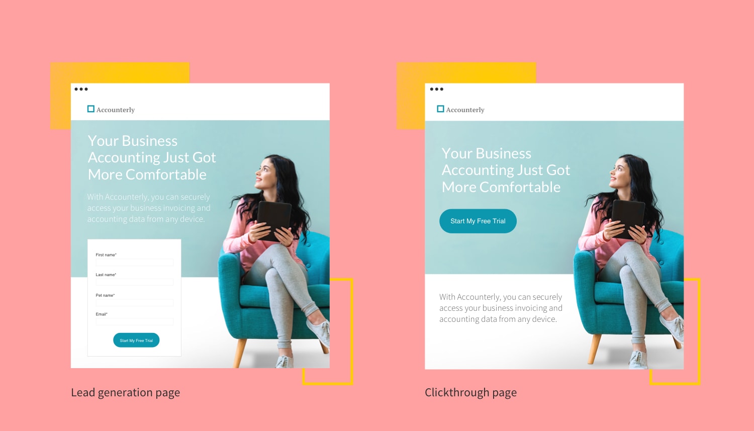
Your landing page title should summarize what benefits you offer your visitor. It is important to answer their question: “What’s in it for me?”
2. Make it Visual
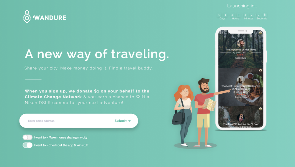
In this case, no one wants to read very long texts. The large text makes a boring landing page. It is better to include a photo, illustration, or video to show the benefits of your product. For example, video landing pages can convert at up to 56%.
3. Stick to One Call to Action
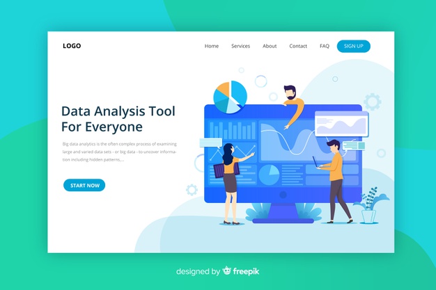
More than 68% of businesses have 5 or more calls to action or links on their landing pages, but research shows that having just one call to action leads to higher conversions. Limit distractions with just one call to action. Make it descriptive: Think "Boost your conversion rate now" rather than "Submit your form."
4. Ditch the Navigation
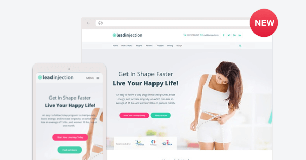
Do not include navigation or exit links on the landing page; the goal of your page is to keep the user there until they convert. Research shows that removing navigation menus can increase conversions by 100%.
5. Drive Conversions
Make the conversion profitable for your potential customers. Offer a value proposition of content, such as an ebook, checklist, or white paper. You can also increase customer confidence by offering a free trial or money-back guarantee.
