What Is Mobile-First Design: Examples and Tips
Aug 08, 2024 9626 seen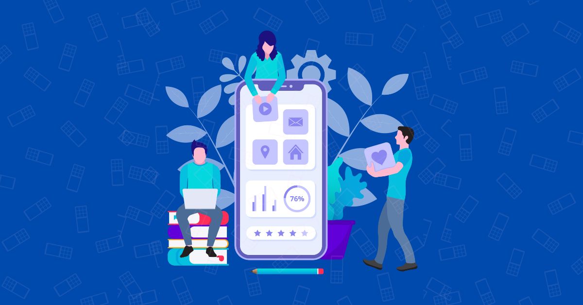
What is Mobile-First Design?
As the name says for itself, mobile-first design is when the mobile version of a website or application is designed first to optimize the user experience on smaller screens, or in other words, when the mobile design is prioritized above the desktop one. The main difference is that the classic design process usually begins with the desktop version and then works on mobile. But in this case, the design process starts with mobile.
As we know from statistics, most people access the internet primarily through mobile devices. Mobile users have specific needs and limitations, such as smaller screens, slower internet speeds, and touch-based interfaces, which affect their overall experience. A mobile design first strategy aims to answer all mobile users' needs.
One of the main benefits of mobile-first design is better SEO results. Websites optimized for mobile devices rank higher in search results on search engines like Google. So yeah, if you don't have a good SEO specialist, get one! Businesses can improve their search rankings and increase organic traffic by designing with mobile devices in mind. The mobile-first design also simplifies the execution of the responsive design. This allows websites to adapt to different screen sizes and gadgets, enhancing the user experience.
Mobile First Design Examples
Consider a travel ticket booking app that lets users book flights, trains, and buses. When designing this app with a mobile-first approach, prioritize key features for small screens, such as search, date selection, and booking confirmation, using a touch-based interface for easy navigation.
Optimize for slow internet speeds and limited data plans by minimizing images and videos, reducing server requests, and compressing data. This ensures the app loads quickly, even on slower mobile networks.
Incorporate mobile-specific features like saving tickets or boarding passes directly to devices and sending push notifications for flight delays or cancellations. These features enhance the user experience, making the app more convenient and user-friendly.
Ensure the app is responsive, adapting to various screen sizes and resolutions, allowing users to access it from any mobile device.
By focusing on the mobile user experience, the travel ticket booking app provides a seamless, convenient experience, improving user engagement and increasing conversions.
Implementing Mobile-First Design
- Prioritize Content: Start by selecting the most important content and features for mobile consumers. This information should be freely available and clearly displayed on your website's mobile edition.
- Simplify Navigation: Given the restricted area on mobile phones, it is critical to simplify navigation. Use clear and simple menus, and think about incorporating hamburger menus or other space-saving navigation options.
- Optimize design for touch interactions. Make sure buttons and links are clearly accessible, and avoid utilizing small or closely spaced items that are difficult to engage with on a mobile device.
- Responsive Design Techniques: Use responsive design techniques like fluid grids, flexible images, and CSS media queries to ensure that your design adapts smoothly to multiple screen sizes.
- Test Across Devices. Regularly test your mobile-first design on a number of devices and screen sizes to ensure a consistent and optimal user experience. Use tools such as Google's Mobile-Friendly Test to discover and resolve any issues.
- Optimize Your Site's Performance by reducing file sizes, utilizing browser caching, and lowering server response times. A quick and flexible website is critical for retaining mobile visitors.
Successful Mobile-First Designs
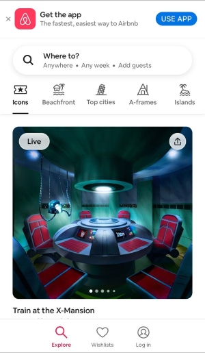
Airbnb's mobile-first strategy has been critical to its success. Airbnb's emphasis on a seamless and intuitive mobile experience has made it simple for users to browse for lodgings, book stays, and contact with hosts while on the go.
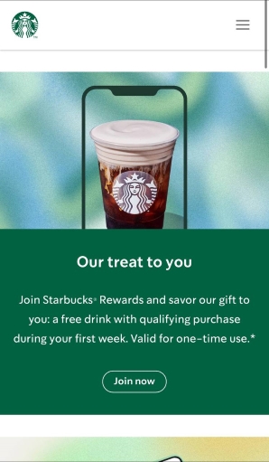
Starbucks' mobile app demonstrates the benefits of mobile-first design. The app's user-friendly interface and efficient functioning have resulted in widespread adoption, making it an essential tool for customers to order and pay for their drinks effortlessly.
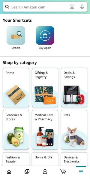
Amazon's mobile-first approach has been a driving element in its e-commerce success. The mobile app and website are intended to create a seamless shopping experience, with features such as one-click purchasing and personalized suggestions targeted specifically for mobile customers.