10 Common UI Design Mistakes
Mar 31, 2021 7288 seen
1. Unresponsive Design
It is bad when customers cannot enjoy the best features of your website, especially on their small screens. As a result, they leave. Responsive design may help users to avoid uncomfortable journeys.
✅ Website flexibility across all of your users’ screen resolutions and devices.
2. Unintuitive Navigation
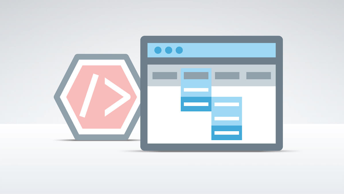
It is confusing when you expect to find the menu or other items horizontally or on the left as a vertical sidebar, but it is not there. Your website navigation should be clear, easy to find, and it should meet your visitors’ expectations.
✅ Keep the number of menu items under 5 or 6.
3. Too Much Text
Having too much text on your pages may either overwhelm your visitors or distract them from taking action. No one has time to sift through blocks of text.
✅ Create Convincing and Succinct Text.
4. Uninviting CTAs

Call-to-actions or CTAs are used all the time in the marketing world. This can be as simple as two words or simple text with a hyperlink or a clickable button. In this case, the color, text, and size of CTAs are very important.
✅ Testing all CTAs before you come up with the best one.
5. Making the User Think
As we mentioned before, simplicity is one of the most important characteristics of effective UI. If any part of the experience gives your users a headache, they will simply bounce.
✅ Give Users a Smooth and Fast Journey.
6. Copying Others Work
Inspiration can strike at any moment. It is easy to find amazing works, pretty animations, and gradients in Dribbble, Behance, or Pinterest. However, it is okay to be inspired by someone else, but you need to rework it into your own thing.
✅ Find Inspiration but do not Blindly Copy the Work.
7. No Social Proof

Customer feedback and testimonials may not be essential UI elements, but they should have their place on every relevant page.
✅ 70% of Buyers Look at a Product review before Making a Purchase.
8. Focusing on How it Looks, not How it Works
Every designer hates to break their design. Breaking a design means inputting data that would ruin the layout or aesthetic appeal of the interface. For designers, this can be uncomfortable but it’s a crucial component to designing a flexible, scalable, and user-friendly product.
✅ Test Designs and Makes Sure the Interface can Fit a Wide Variety of Use Cases.
9. Not Preparing for Handoff
When we’re designing a product, you should take into account who else is going to be using your work. No matter our designs are handed off to developers or other designers, everything must be organized and appropriately documented.
✅ You Should have an Organized Design file that Contains all the Icons in SVG format.
10. Designing for Yourself
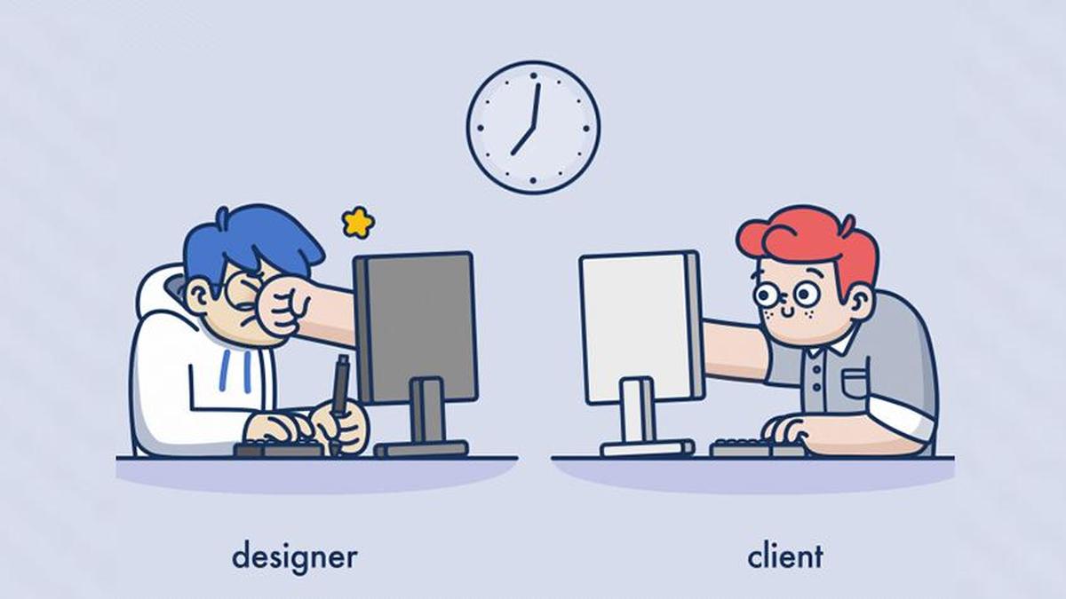
Remember, you’re not designing for yourself, but a fictional user persona. That persona could have the same interests, preferences, and pain points as the ideal buyer persona, so work closely with your marketing and sales teams to pinpoint the best design approach.
✅ Don’t Stop Testing until the Feedback is Perfect.

