10 Web Design Trends in 2022
Jan 07, 2022 9872 seen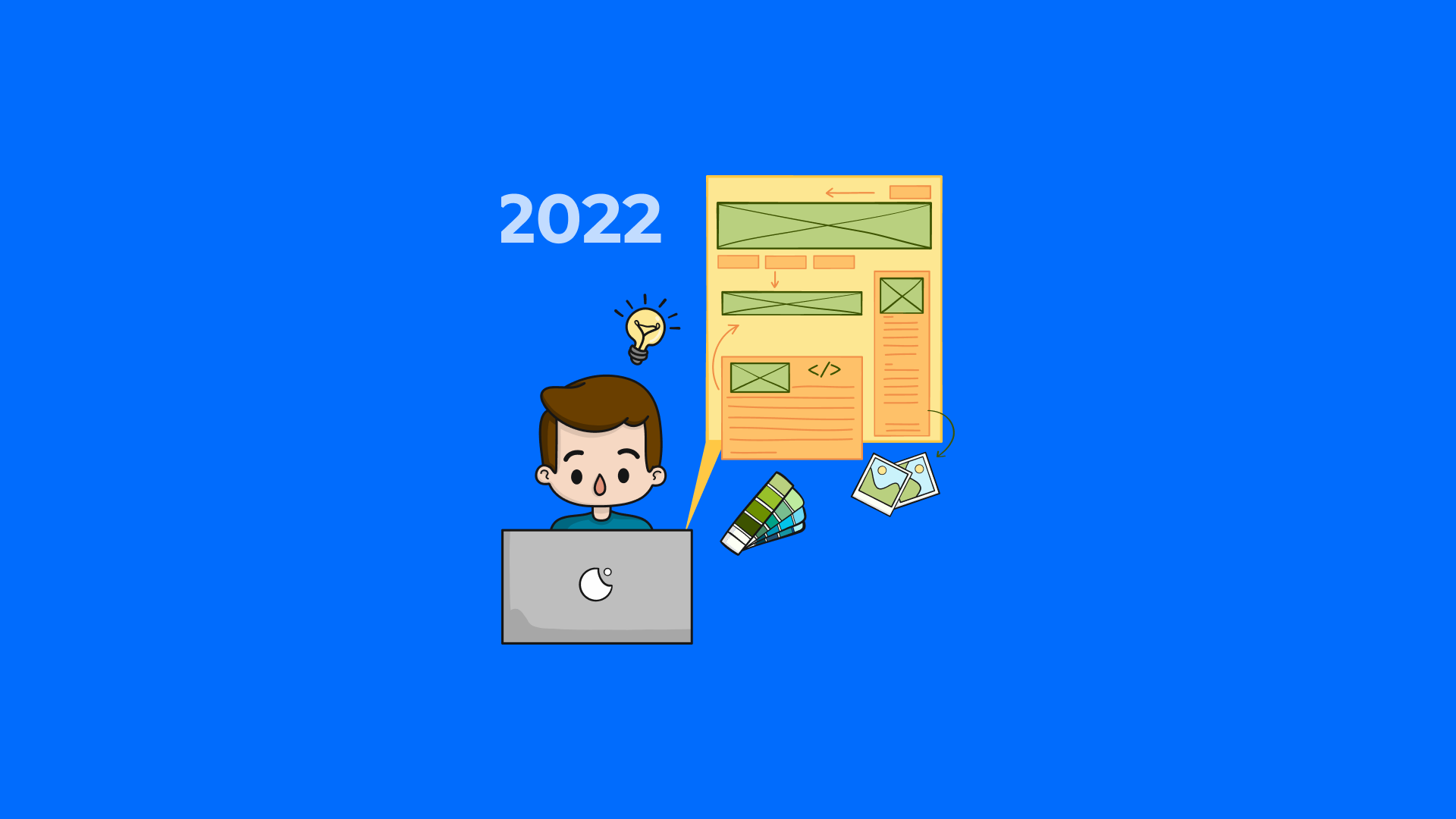
1. Parallax Animation
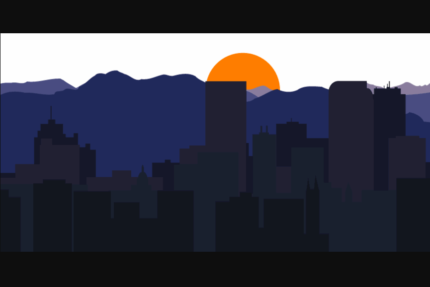
Parallax animation adds a sophisticated look to websites and is popular in new website designs. The background and foreground elements are separated in parallax animation. Images in the foreground move faster than images in the background because they are closer to the viewer. When users begin scrolling down the page, the background images change more slowly. This causes the foreground images to appear to float on top of the background, adding depth.
2. Neumorphism
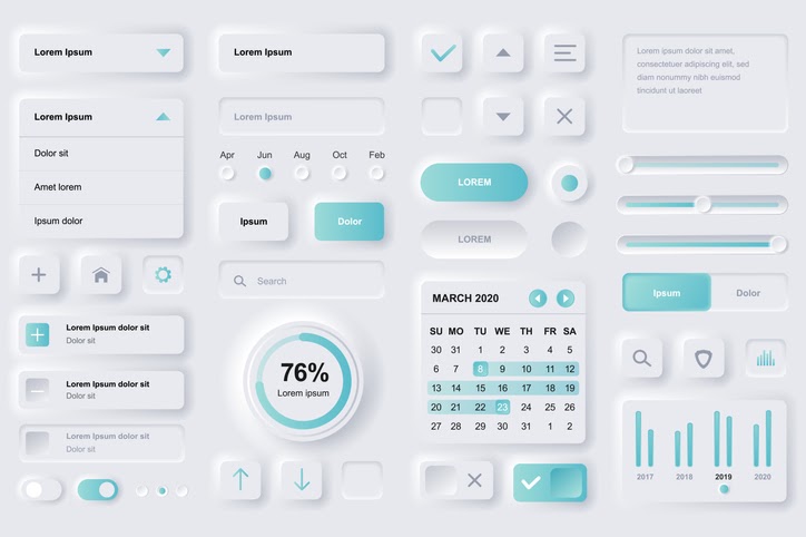
Neumorphism is a modern web design trend that deviates from the popular flat design of recent years. Neumorphism focuses on the design of user interfaces that are minimal but realistic. UI elements in flat design float in space, casting shadows on the objects beneath them. The UI elements extrude from the background images in Neumorphism-inspired designs. The effect is similar to embossing or debossing on paper.
Subtle shadows and gradients work together to create a fashionable look. Neumorphism provides a clean and modern look for websites in 2022.
3. Dark Mode and Low Light UX
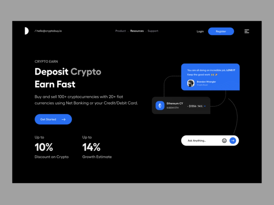
Image source https://dribbble.com/shots/16305060-Landing-UI-Dark
Dark mode and low light UX are two other modern web design trends. This trend deviates from the previous years' traditional white and bright designs.
Many mobile and desktop operating systems included dark mode options, allowing users to optimize their screen viewing in low-light conditions. The trend is shifting to website design, particularly for web-based products such as streaming services, which people will most likely view in low-light environments.
4. 3D Colors
A little gradient and shading can go a long way. Adding depth to backgrounds and images with tints allows these elements to pop off the page. If you were trying to paint an image of an apple, you would not use just one shade of red.
5. Minimalism
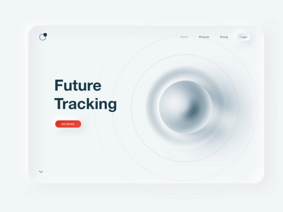
Minimalism is a timeless yet trendy approach to web design that is still in demand. The minimalist design aesthetic incorporates both beauty and functionality. Every design element, including images and fonts, serves a purpose. The goal is to remove any unnecessary design flourishes until you're left with only the essentials.
6. Oversized Typography
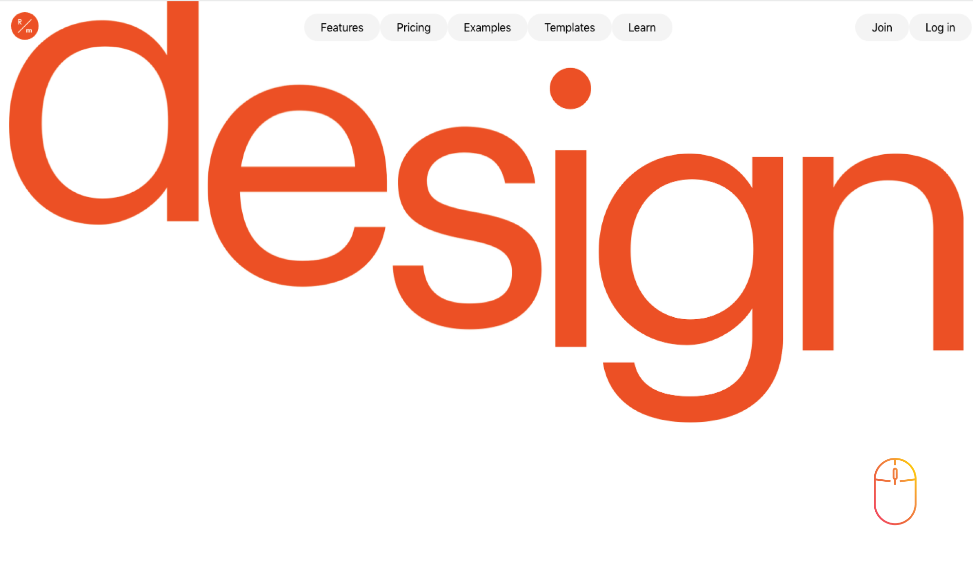
Typography in unusual sizes is a new and daring design trend for this year. Words become more of a graphic element than a part of the copy at a certain size. This is a versatile technique that works equally well in minimalist and maximalist designs and can accommodate a wide range of styles.
7. Illustrations
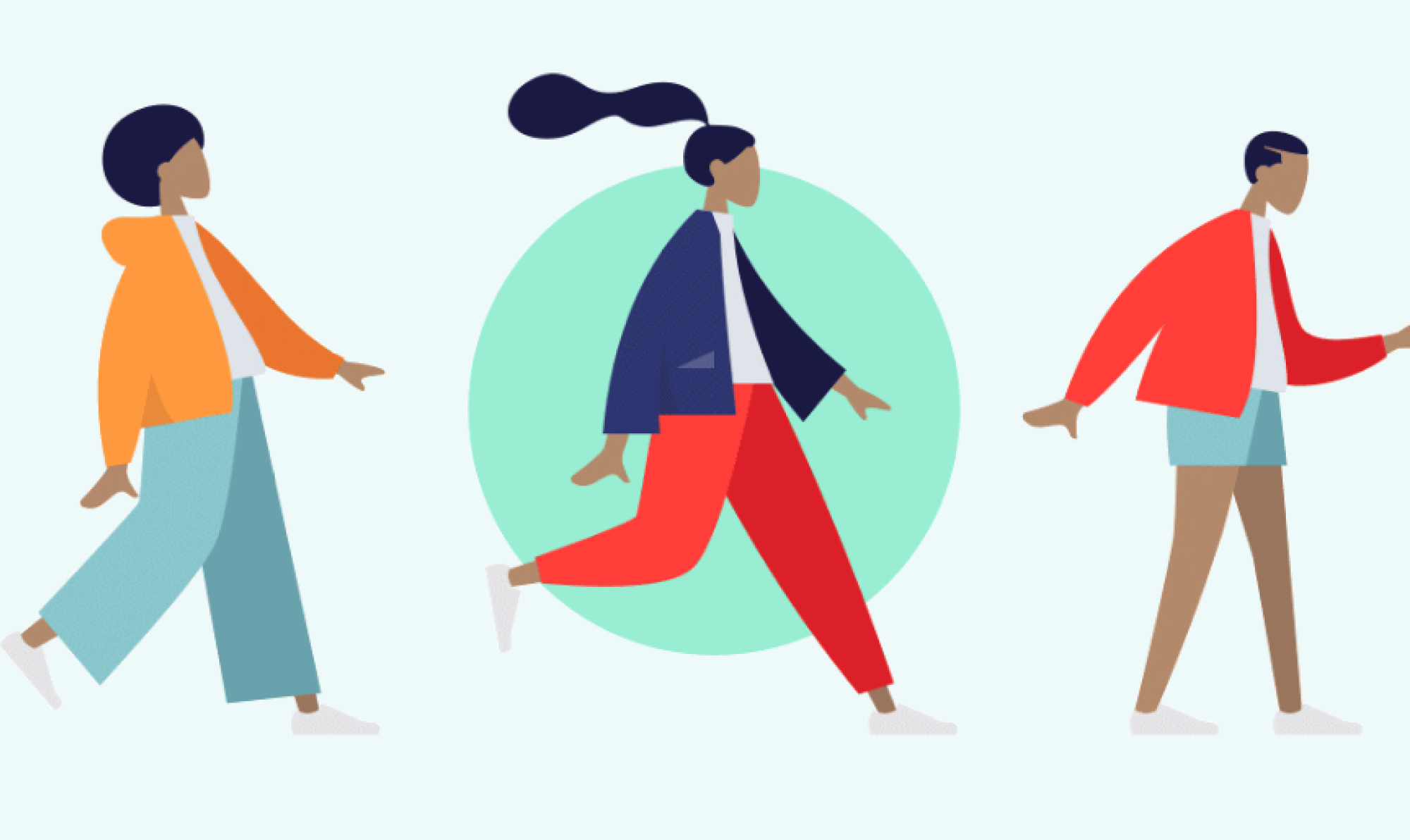
Illustrations, like hand-drawn sketches, are a popular web design trend. Illustrations have a more modern and crisp appearance than hand-drawn imagery. The goal in both cases is to avoid using stock photography. Stock images can easily make your website appear identical to that of your competitors or any other website. When your site's imagery isn't unique, it's difficult to stand out. Using illustrations instead of photos allows you to tailor your imagery to better fit your brand. Even if you use stock illustrations rather than paying for custom images, you can recolor them to match your brand's color palette.
8. Interactive fonts
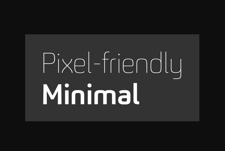
Taking text use even further, some designers have found inventive ways to make their text move and interact with the user's mouse. A hover-state change, similar to that of a button, is a simple way to make text interactive. It also helps that it is now easier to create more complex effects using modern no-code platforms than it was to try to write these interactions by hand. When incorporating interactivity into fonts, keep legibility in mind because moving characters can distract some users.
9. Accessibility
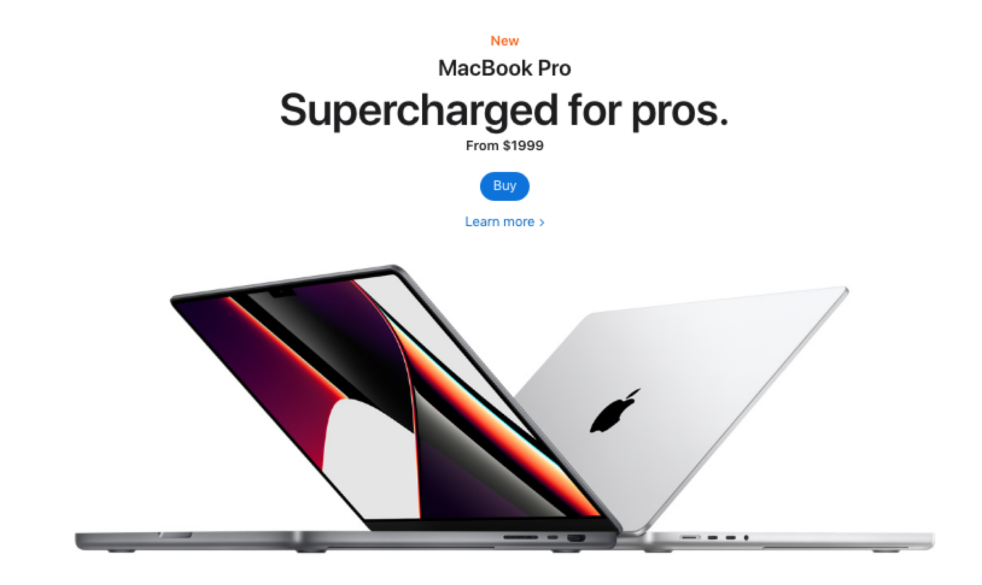
image source https://www.apple.com/
The goal of accessibility in web design is to ensure that everyone can access and use your website. While accessibility is on the list of 2022 trends, it has been around for a while and is here to stay. It's simply something that web designers are talking about more now than they have in the past. Using appropriate color contrast between backgrounds and text to improve readability is another way to incorporate accessibility into modern web design. When people use keyboard navigation, focus indicators are displayed.
10. White Space
White space is still a popular web design trend. The term "white space" is a bit misleading because the space does not have to be white. The design concept refers to the practice of leaving white space around design elements. As a result, the "whitespace" is usually the color of your site's background.
White space is useful in web design because it makes the site appear less cluttered and overwhelming. White space can also be used to draw the attention of viewers to a specific element.
