4 Ways To Use Photos In UI Design
Jul 16, 2021 9160 seen
Photos in UI Design
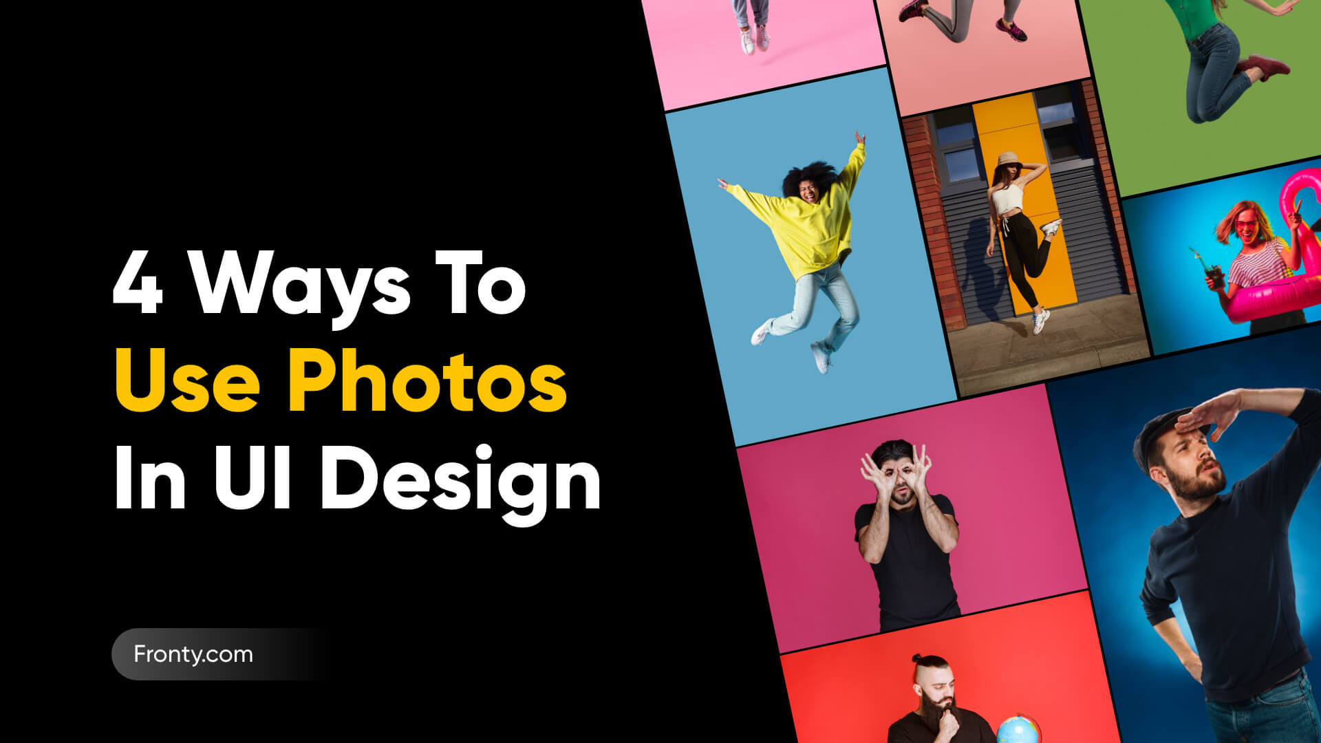
Many designers underestimate the importance of photography in web design. You can spend hours looking for really good photos. The problem is, you need to know what you are looking for. In this article, you will learn which photos are best to use in user interface design, as well as which photos should be avoided. Why is it important? Photography is essential for the mood of your UI design. Photography is one of the most powerful tools for defining how a brand is expressed when it comes to digital products for the web and mobile. A well-placed photograph can tell a story even more effectively than words.So, we’ve highlighted some tips on how to use photography in your UI design:
1. Stick To High-Quality Photos
If your UI design needs photos and you’re not a photographer, you’ve got two options: hire a professional photographer or use high-quality stock photography.
There are dozens of great resources where you can buy quality stock photos. There are even websites that offer beautiful photos for free. Here, you can find some of them.
2. The Problem Of The Stock Photography

While stock photography is a great option for finding high-quality photographs, you should choose your photos carefully.
How many screens on the Internet have you seen with the same happy smiling faces? Competent business people in laconic suits? Try to avoid clichés and standard stock photography whenever possible. This will help make your UI design more authentic and human.
3. Ensure Any Text Has Consistent Contrast

Have you ever attempted to put a title on a large hero image and found it difficult to read? This is due to the fact that the issue is with the image. Photographs can be quite dynamic, with a lot of bright and dark areas.
If you need to use a specific photo, you can solve the contrast problem in one of the following ways:
- Adding an overlay
- Decrease the contrast of the image
- Coloring an image
- Adding a drop shadow to your text
4. Less Is More

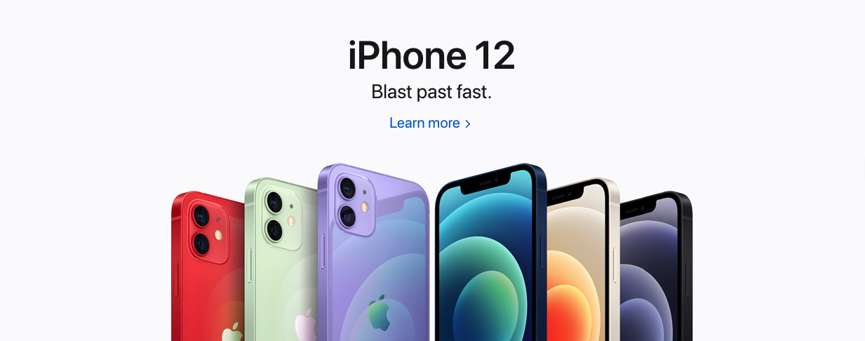
Image source - https://www.apple.com/
You've probably heard this phrase before. Sometimes the best decision you can make is to focus on the clarity and easiness of your product so that you can easily grab the user's attention.
Apple's home page is a great example of a focus on photos. It's sleek, clean, and uses a huge amount of white space and large full-screen images to create a bold design. You can visit any page on their website and see the practice of "less is more" - obviously Apple's favorite rule.


