What is the Color Theory?
Apr 05, 2021 8379 seen
What is the color theory?
Colors have a strong impact on us, they may influence individuals, despite age, gender, and culture. Color can impact our emotions, physiological reactions, or even blood pressure. Color theory is a collection of rules that designers use to combine colors and communicate with users. Simply put, this theory is both the science and art of using colors.
There are two basic categories of color theory that are logical and useful: The color wheel and color harmony.
Color theory may help to select balanced and effective color combinations.
The Color Wheel
The color wheel is the color circle that includes primary colors; red, yellow, and blue, and secondary colors; a mixture of primary colors.
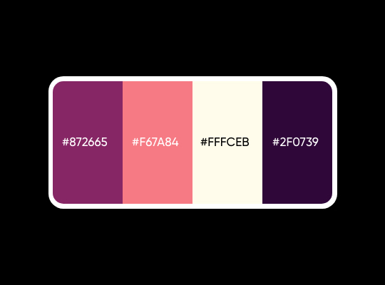
Use color wheels to select the actual colors. Lay complementary colors next to each other to get a brighter and vibrant effect. By using a color wheel you can create three popular types of color schemes:
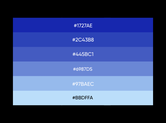
1. Monochromatic schemes - single color with variations of tints and shades.
✅If you want to get a soothing effect use this.
2. Analogous schemes - one color is the dominant color, others support it.
✅If your target is a visually appealing project, this is a great option.
3. Complementary - consists of only two contrasting colors.
✅If you want to attract attention, use this.
Color Harmony
Harmony can be defined as the pleasing arrangement of parts. If something is not harmonious, it's either boring or chaotic. Overall, colors that look aesthetically pleasing side-by-side are called color harmony. At one extreme is a visual experience that is so bland that the viewer is not engaged.
In summary, extreme unity leads to under-stimulation, extreme complexity leads to over-stimulation. Harmony is a dynamic equilibrium. Try to keep your color scheme simple, with a maximum of two or three colors. Instead of using many colors, play with shades.
Below, you can find some interesting facts about colors and their impact on humans․
Gender and color
- Blue is the most common color for men and women.
- Pink isn’t a favorite color for women.
- Orange, brown, and yellow are the most unpopular colors for both men and women.
- Women usually prefer softer colors, whereas men prefer bright, contrasting colors.
Age and color
Studies found:
- Young people prefer colors with longer wavelengths, such as red and orange.
- Older people like colors with shorter wavelengths, such as blue.
Conclusion
Color is one of the tools that designers love to play with. Nevertheless, it’s one of the tools that can be tricky to master. The rules mentioned above will set a good foundation for visual designers, but the only way to improve is to master the skill of creating great color combinations. Practice makes perfect.