The Psychology of Color in Web Design
Mar 20, 2021 8262 seen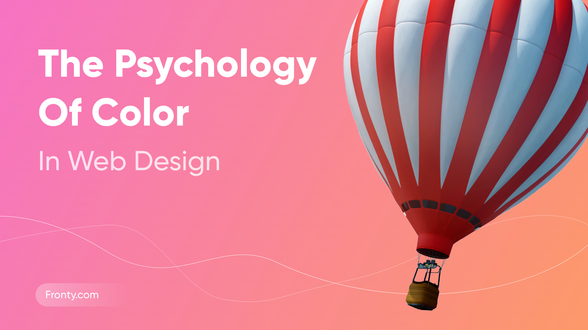
Color may influence individuals, and that depends on age, gender and culture. It influences not only how people feel, but what they do. Color psychology is also used in marketing and branding. Besides, according to studies, people decide do they like a product in 80 seconds and 90% of that decision is based on color. In this article, you can find how you can use different colors in your digital strategy.
The psychology of red
The red color is associated with love, energy, and lust, but it also has some potentially negative associations – war, anger, and danger.
- Use it ✅
When you need to draw attention to something. Red can be good for food, sport, marketing.
- Avoid it ⭕️
Too much red can be a bad thing. It does not work luxury goods, nature-related content.
The psychology of yellow
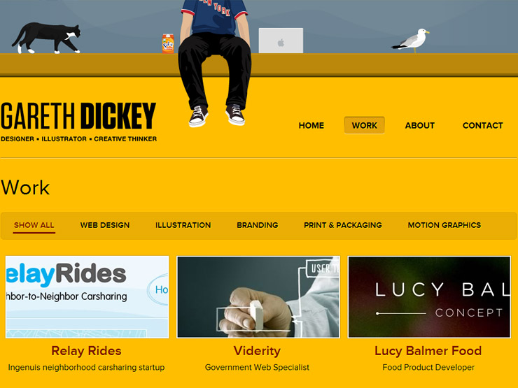
Yellow is a very bright color. This color is associated with happiness, optimism, and youth. Nevertheless, yellow also has some negative associations such as deceit, and cheapness.
- Use it ✅
When you need to energize people. It can be great for call-to-action buttons.
- Avoid it ⭕️
Yellow can become overpowering. Too much yellow can feel cheap.
The psychology of orange
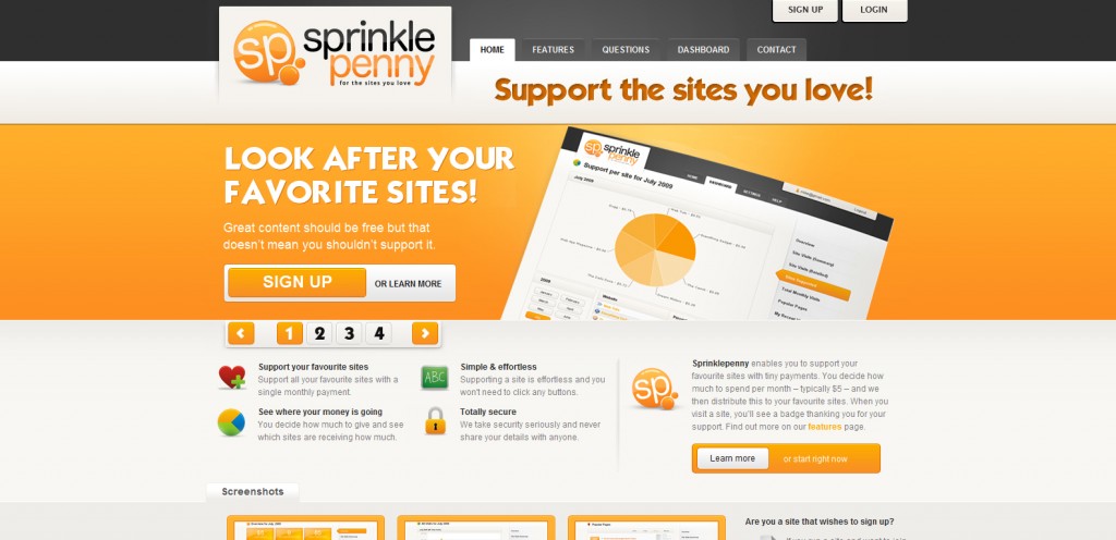
Orange is a combination of red and yellow and is an energetic and vibrant color. It is often associated with fun, warmth, ambition, and enthusiasm.
- Use it ✅
When you want to make sure people notice your content. It can be good for automotive, technology, entertainment.
- Avoid it ⭕️
Again, do not overuse it.
The psychology of blue
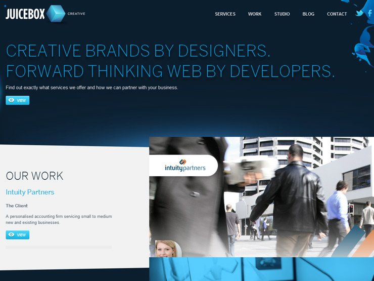
Many people find that blue can be associated with quality, calmness, trust, relax and security.
- Use it ✅
It is good for health care, science, large corporations, and banks.
- Avoid it ⭕️
Too much blue makes your website feel cold, also can curb appetite.
The psychology of green
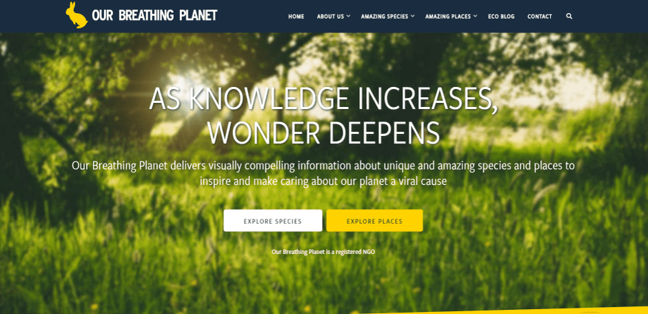
The green color is associated with summer, environment, activities, and wellness.
- Use it ✅
When you need to create relaxing, calming content. It is good for tourism, the environment, and human resources.
- Avoid it ⭕️
It is bad for luxury goods and tech.
The psychology of black
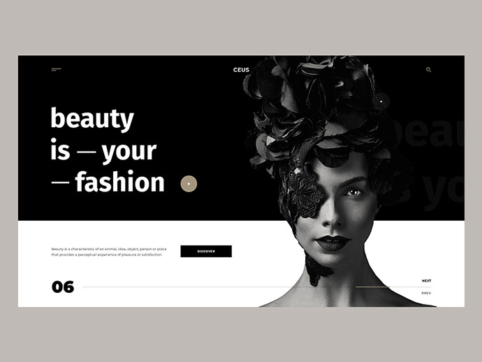
Black is associated with elegance, authority, power, and glamour. Anyway, it also has negative associations, including darkness and death.
- Use it ✅
When you need luxury content. It can be good for fashion, cosmetics, and goods. It also can play well with vivid colors for a sleek, modern feel.
- Avoid it ⭕️
It can be overwhelming, menacing or evil, and can make people feel uncomfortable.
The psychology of white
This color is associated with cleanliness, innocence, and safety.
- Use it ✅
It is good for science, health care, and the high-tech industry. On the other hand, when it is paired with black, silver, or gray, can be good fr luxury and goods.
- Avoid it ⭕️
Since the effects of white depend almost entirely upon the other colors in the design, it can theoretically be used for any type of website.