What Is 8 Point Grid System In UX Design
Nov 27, 2022 18782 seen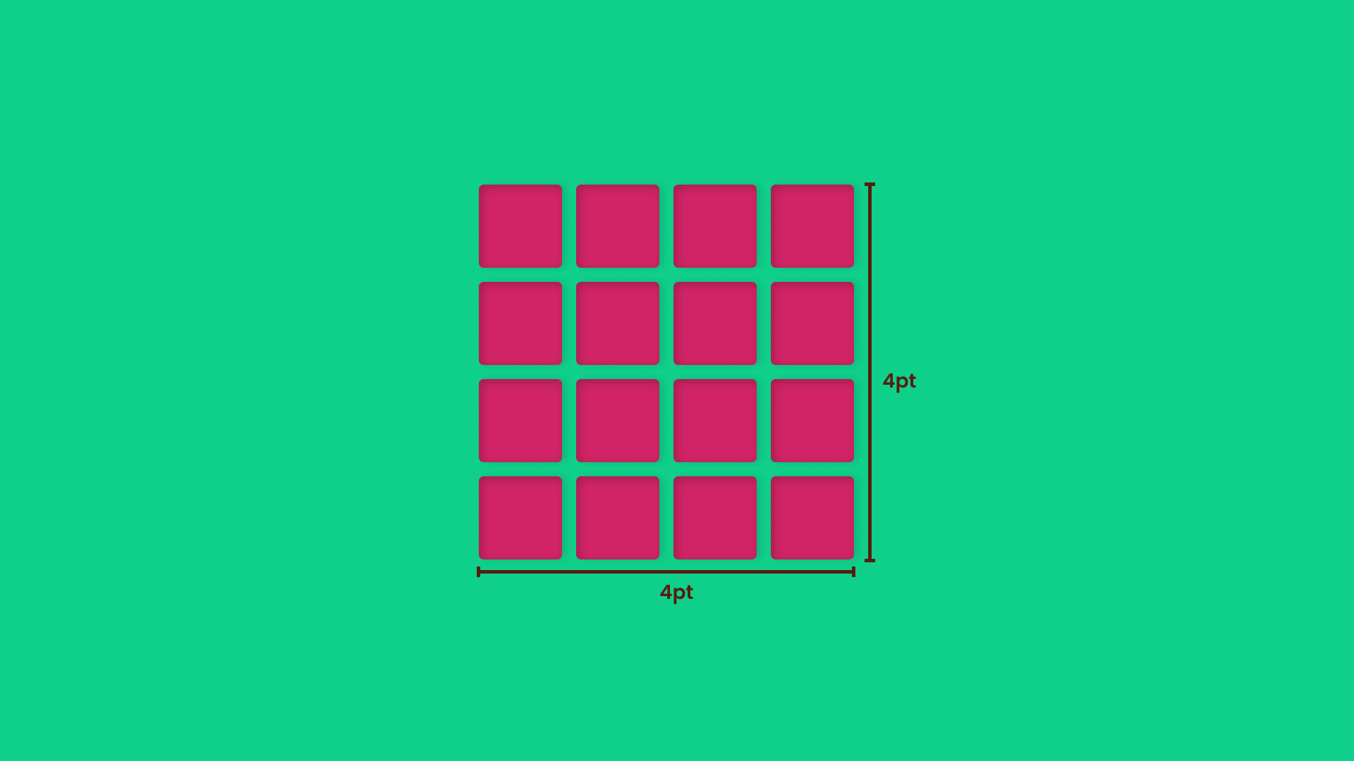
Why Use An 8pt Grid system?
Do you recall schoolbooks with vertical and horizontal lines intersecting and forming little squares? They made writing and solving math problems much easier and kept the pages organized. The grids, on the other hand, behave in a very similar manner. A grid is a skeleton that can be used to create a variety of looks. However, its primary goal is to improve design comprehension by creating clarity and consistency on the page.
Want to know what the best part is? Grids are simple to implement on your website and are guaranteed to increase conversions. Continue reading if you want to learn more about grids and how to use them.
There are various screen sizes for websites, apps, dashboards, user interfaces, and so on. Pixel densities have continued to rise, complicating designers' work in asset generation. The use of numbers such as 8 to size and space elements makes scaling for a wide range of devices simple and consistent. Furthermore, the majority of popular screen sizes are divisible by 8, making it simple to fit. The 8pt Grid principle states that multiples of 8 (8, 16, 24, 32, 40, 48, 56, etc.) are used for the layout, dimension, pad, and margin of elements.
The Meaning of 8pt Grid system
-
It creates a visual hierarchy for elements and promotes consistent scalability by requiring fewer decisions while maintaining a quality rhythm. When designing the UI, make it look cleaner, better, and more beautiful.
-
The most effective communication system between designers and developers. Instead of measuring each time, a developer can easily understand and eyeball an 8pt increment.
If you're designing for the web, you must use responsive design (web pages that look good on all devices). Also, when designing for mobile, you must ensure that it will fit on all devices. That is why it is critical to establish a layout system (8 points + Bootstrap). For the first time, use a standard bootstrap grid system with a 12-column layout and a gutter width of 24px for Horizontal Rhythm/grid (1.5rem). If you used a 1440px artboard (Desktop size), use a 60px margin on each side of the container.
Spacing is critical in UI design because it keeps the design neat and tidy. The user interface appears logical attractive, and beautiful. For all padding and margin between elements, use 8px / 16px / 24px / 32px / 40px / 48px / 56px.