7 Tips For Mobile-Friendly Website
Jun 15, 2021 9646 seen
Mobile-Friendly Websites
Based on some studies, 60% of web traffic comes from mobile devices. To satisfy potential customers, every company must make its site easy to navigate on mobile devices.Here, you can find 7 useful tips to create a mobile-friendly website:
-
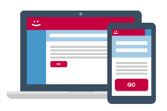
Minimize the menu
-
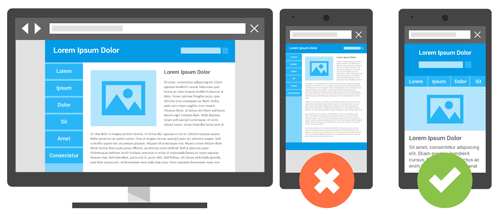
Use Recommended Sizes for Mobile Devices
-
Reduce user text entry required for navigation
-
Break the page into small sections
-
Collapse secondary content
-
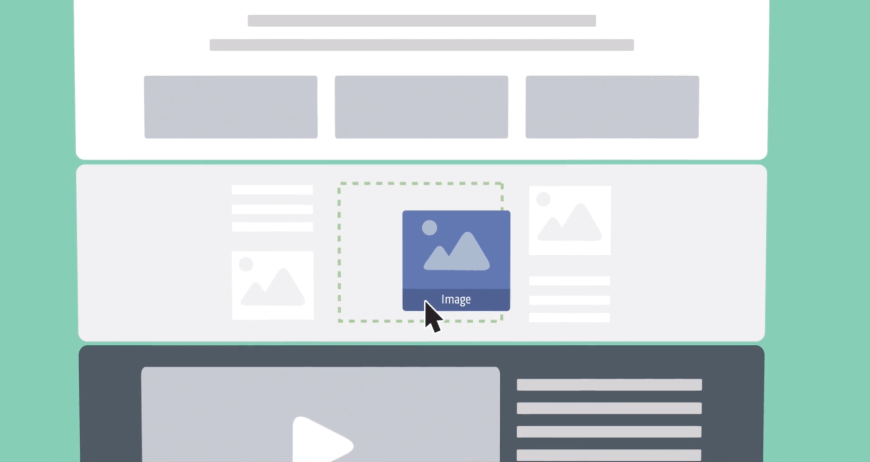
Simplify the design of your site
1. Use the Mobile-First Approach

2. Minimize the Menu
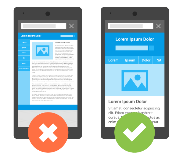
Navigation is another area that can get complicated quickly depending on the number of destinations and options presented to the user. While desktop websites tend to have a full header navigation bar with multiple main menus and submenus, it has become standard to keep it all in a simple, recognizable hamburger icon. As a result, most mobile website titles tend to boil down to this icon and logo.
3. Use Recommended Size Dimensions for Mobile

On a portable device, space can seem more limited than in any other design context. But considering size constraints at the start of your project is the best way to avoid conflicts later on.
4. Reduce the Amount of User-Entered Text Required for Navigation
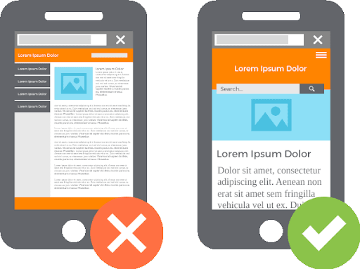
As you probably know, entering text on mobile versions of websites is often incredibly difficult. Reduce user input by replacing it with buttons or a list so viewers can easily select what they need without having to fiddle with typing.
5. Break the Page Into Small Sections
Break the page down into small portions by placing lengthy sections of text on several different pages instead of one page that users have to continuously scroll to view content. Get rid of low-priority content and stick to one column with wrapping text to prevent horizontal scrolling.
6. Collapse Secondary Content
Collapsing content includes adding explanatory information using an icon, such as a triangle or plus sign, that reveals hidden content. While hiding your content may seem bad, the benefits of simplified browsing backed up by compelling headlines far outweigh the likelihood of missing information.
7. Simplify the Design of Your Site
Create a site that allows users to easily navigate the site by avoiding the inclusion of tables, frames, and another formatting. Keep padding to an absolute minimum, because the more users click on your links, the longer they will wait to download. Simplify your website to balance content and navigation.
Related Tutorials