How to Use Whitespace In Websites
Jun 30, 2021 6887 seen
What is Whitespace?
Remember the days when it was best practice to keep everything at the top of the page? The content was often so crowded in this small space that it became extremely difficult to navigate and understand the page. Whitespace is the modern designer's answer to this. Whitespace is often used to balance elements on a page by creating a natural flow for the user to navigate through the content and by that making the information easier to digest. In this short article, you can learn how to use whitespace in websites.
Improve the Legibility of Text
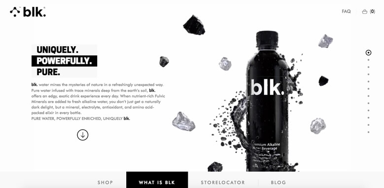
Image Source: BLK
Short-spacing text appears cluttered and difficult to read. However, space is too far apart, and the reader feels disconnected and may lose their place in the text. At a time when users are faced with information overload, if you don't make your content usable, they just won't bother. Correct use of spaces in the text can increase readability by up to 20%. When designing your page, think about paragraph margins and line spacing.
Organize Your Content
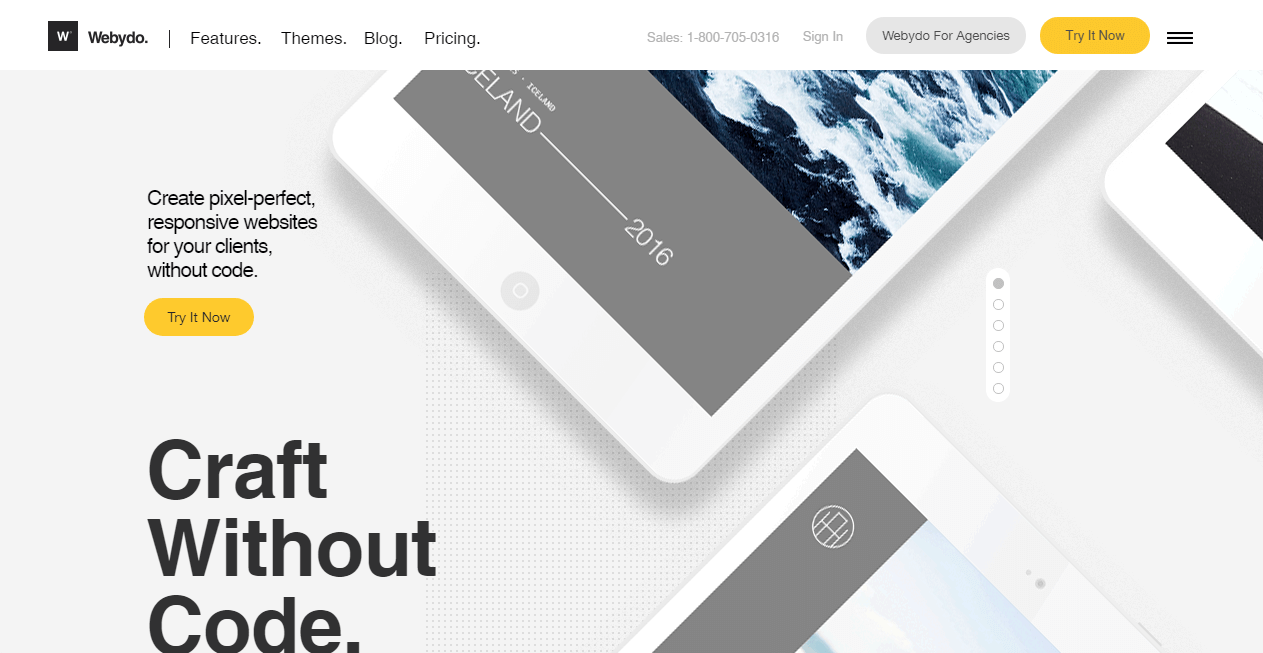
Image Source: Webydo
The Law of Proximity defines how the human eye perceives the relationship between certain visual elements. Things grouped close to each other are perceived as related, while objects at a distance are considered different. The amount of whitespace between your content acts as a visual cue to show visitors the relationship between different content elements. Objects can be grouped by decreasing the space between them or separated by increasing the space. When it comes to text, the Law of Proximity helps us understand the text as a whole by using paragraphs to group ideas together. It is also useful when designing forms by placing labels closer to the corresponding field for clarity.
The Right Impression

Image Source: Built By Buffalo web page
While whitespace is mainly used as a method to improve the user experience of a website, it also has aesthetic uses. If you've ever flipped a glossy magazine like Vogue, you know how generous use of white space creates an impression of elegance, luxury, and sophistication.
It Doesn’t Have to be White!
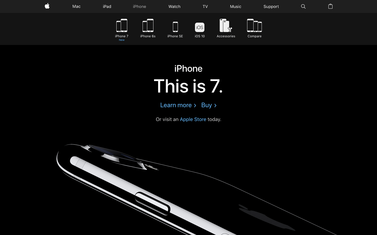
Image Source: Apple's website
You can use any color or lack thereof in your negative space. You can even use a patterned or textured background or background image. If you're designing a site with a long scrollbar, using whitespace is key to keeping the page fluid and managing the organization, focus, and emphasis of your content. A great tip is to alternate additional colored blocks at the bottom of the page to segment different sections while maintaining the direction and flow of content.
Create Focus and Emphasis
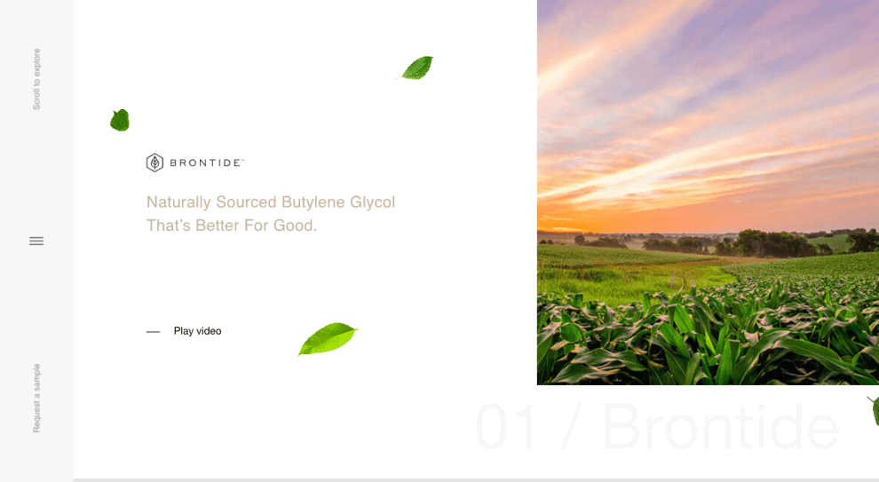
Image Source: The Brontide website
A cluttered interface overwhelms your visitors, confusing them with too much information and losing the main message of the page in the midst of all the noise. By removing these distractions, you draw your visitors' attention to the most important element of the page. The more whitespace around an object, the more attention it gets.